Coral Pay: brand identity case study
Coral Pay mark in lilac glass turning over iridescent waves
Coral Pay logo: the six-petal coral mark and the wordmark, on pale pink
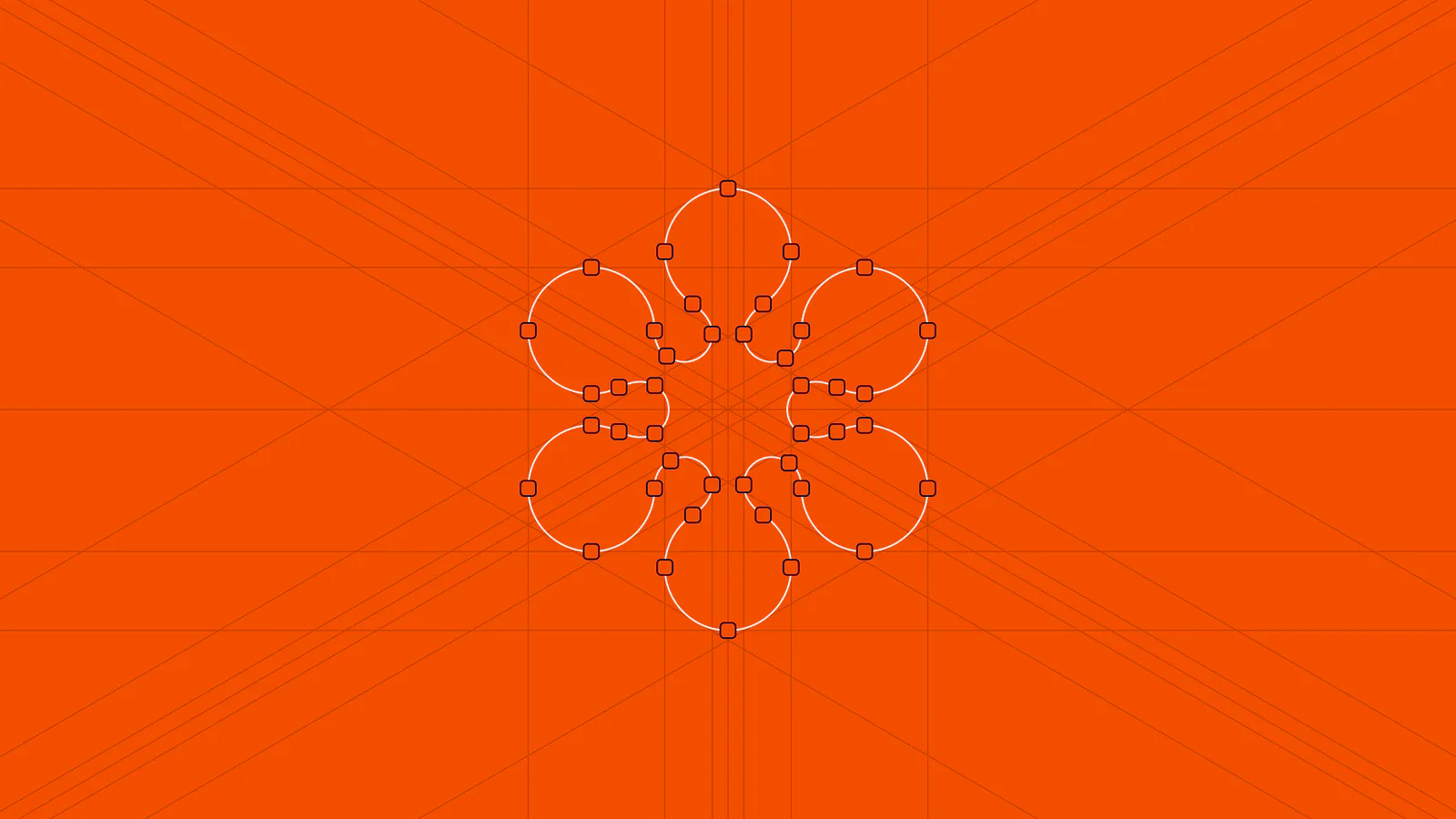
Construction of the Coral Pay mark on an orange grid
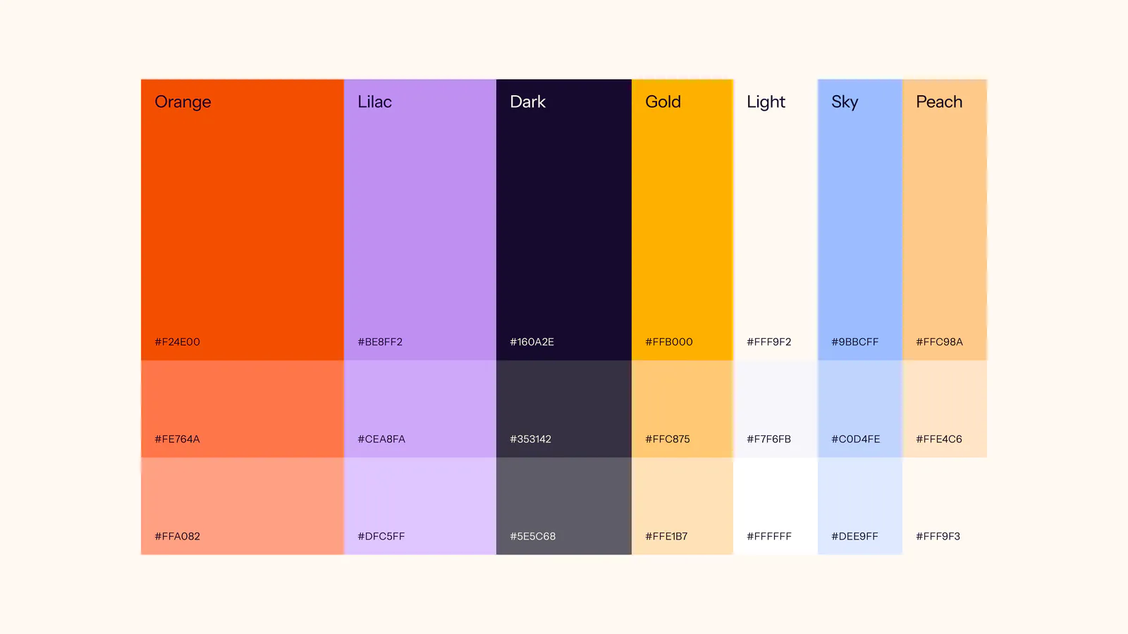
Coral Pay palette: Orange, Lilac, Dark, Gold, Light, Sky and Peach, each with two tints
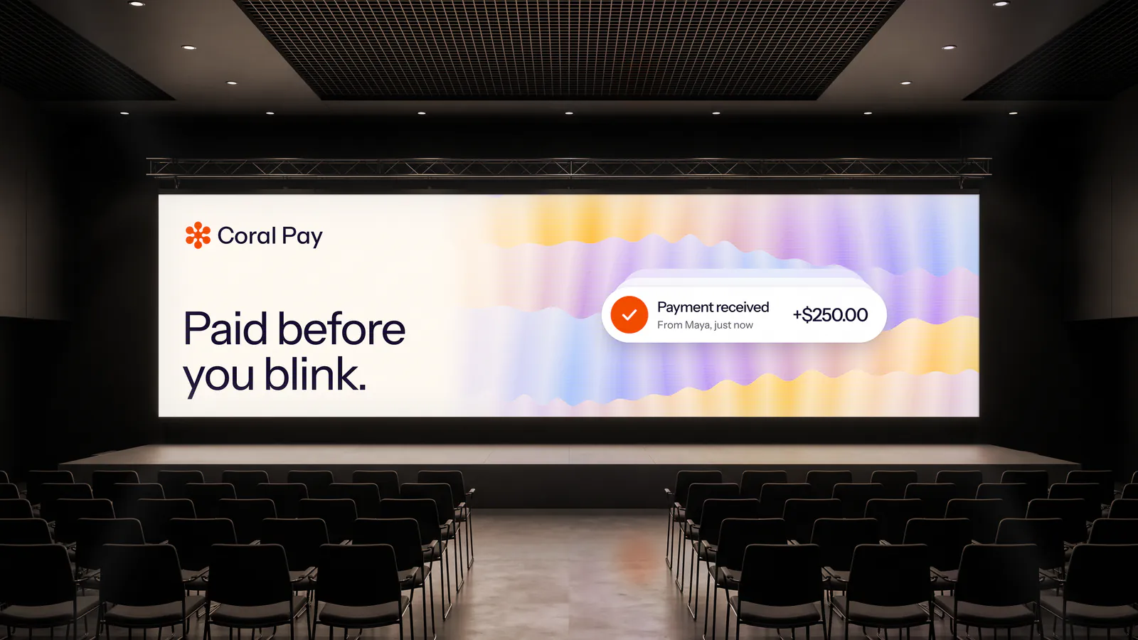
Paid before you blink. on a conference screen, with a payment received notification
Coral Pay app icon on an iPhone home screen
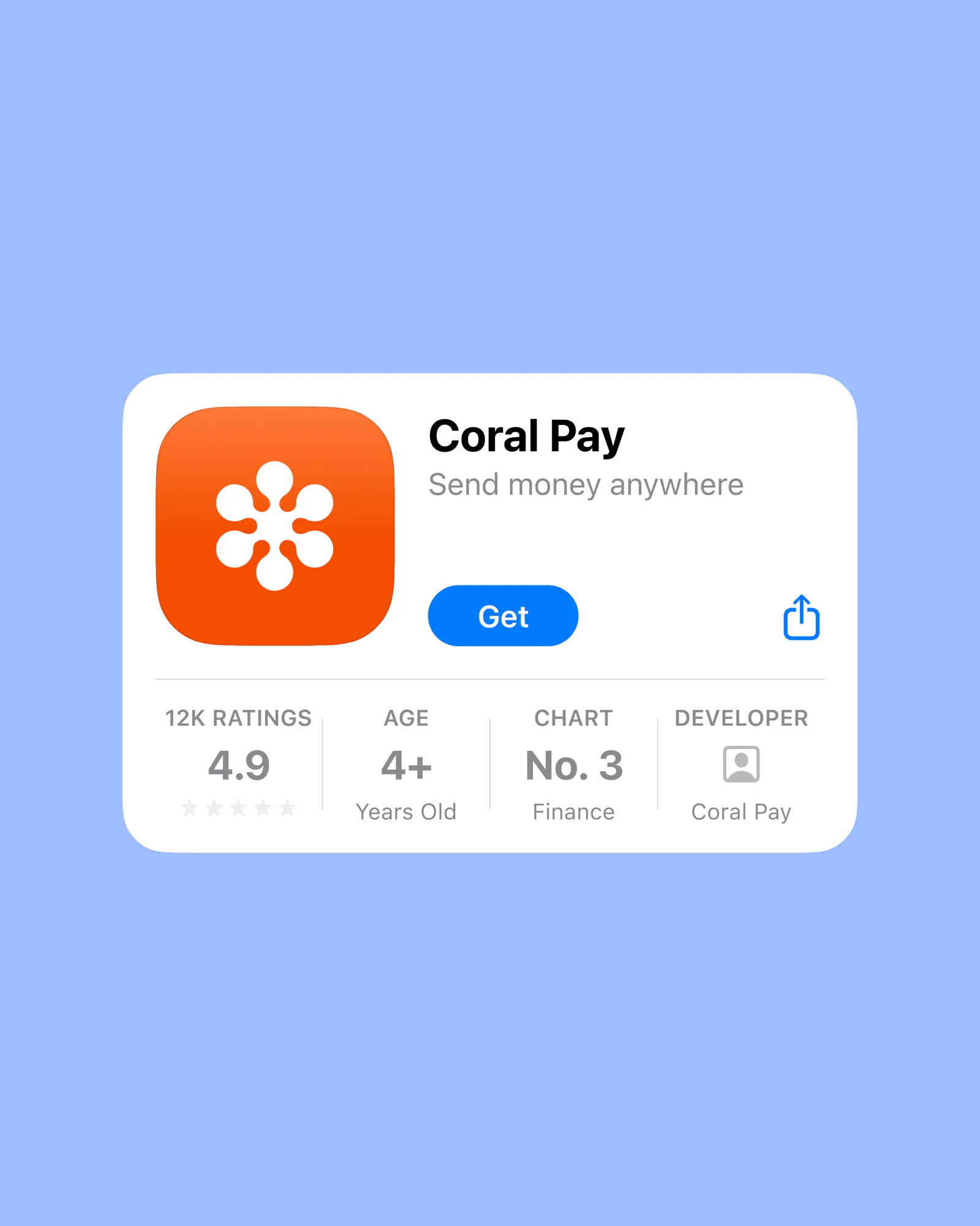
Coral Pay in the App Store: Send money anywhere, rated 4.9
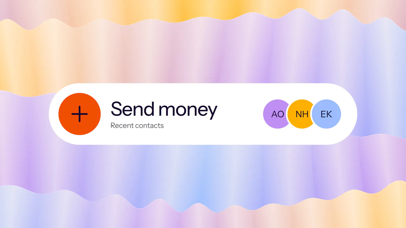
Send money card with recent contacts, over iridescent waves
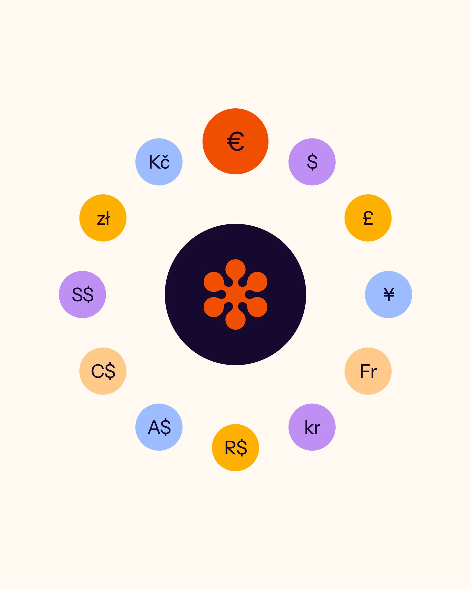
Currency symbols circling the Coral Pay mark
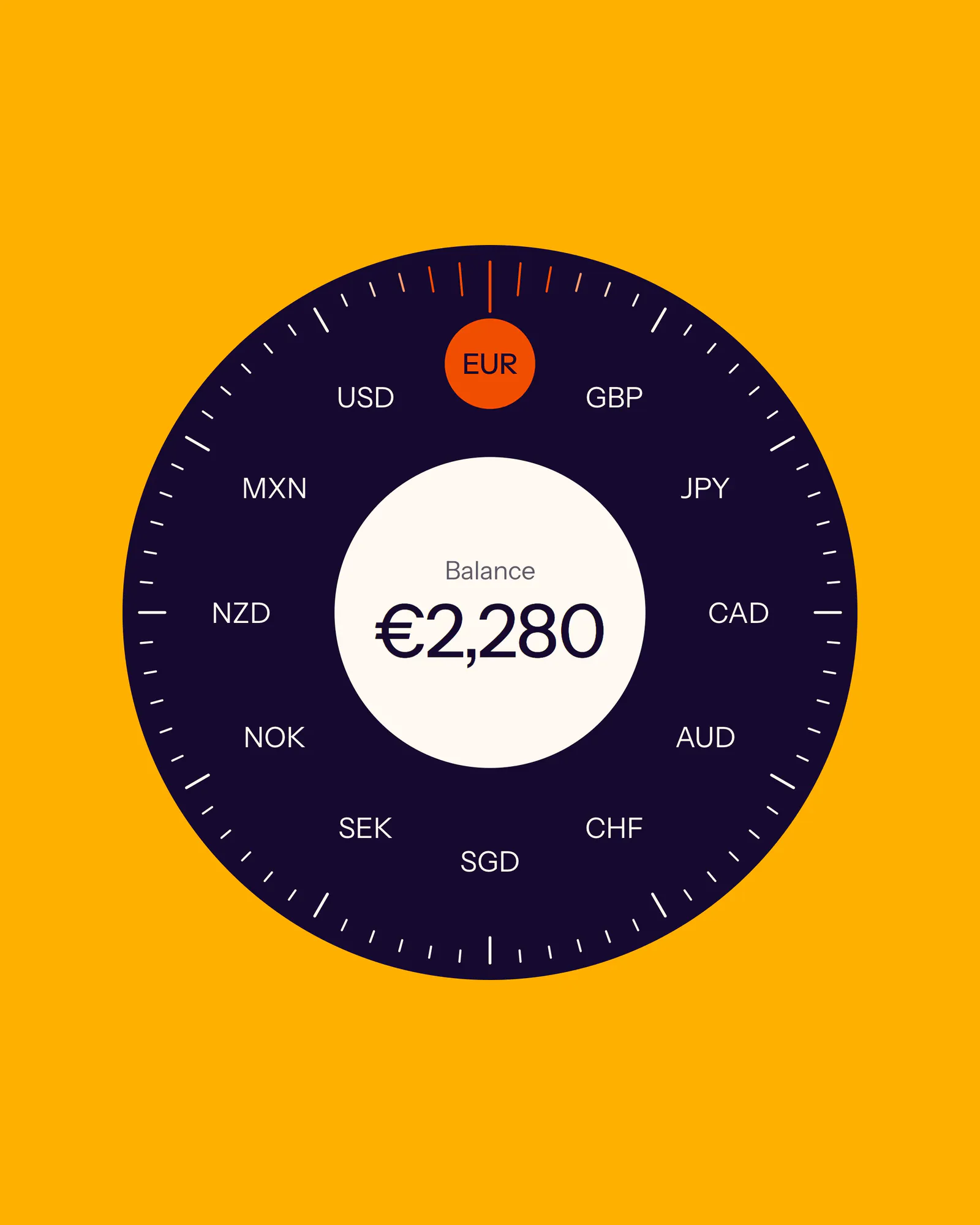
Balance dial turning through currencies, on gold
Browser bar with the Coral Pay app icon and the address coral.pay, on dark violet
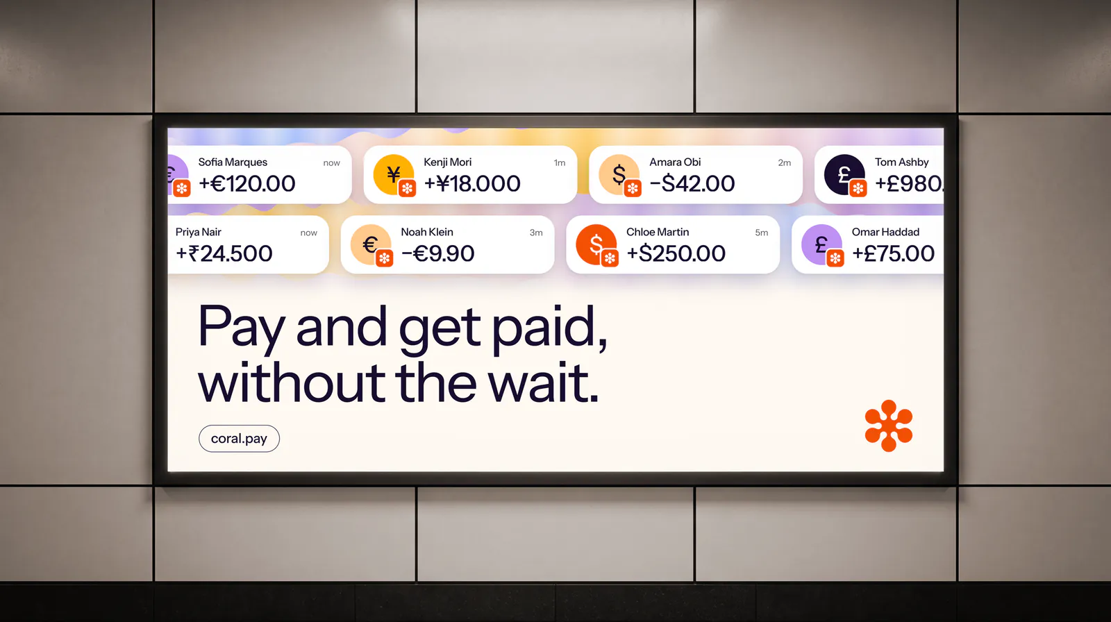
Lit poster on a tiled wall: Pay and get paid, without the wait. above payments in several currencies
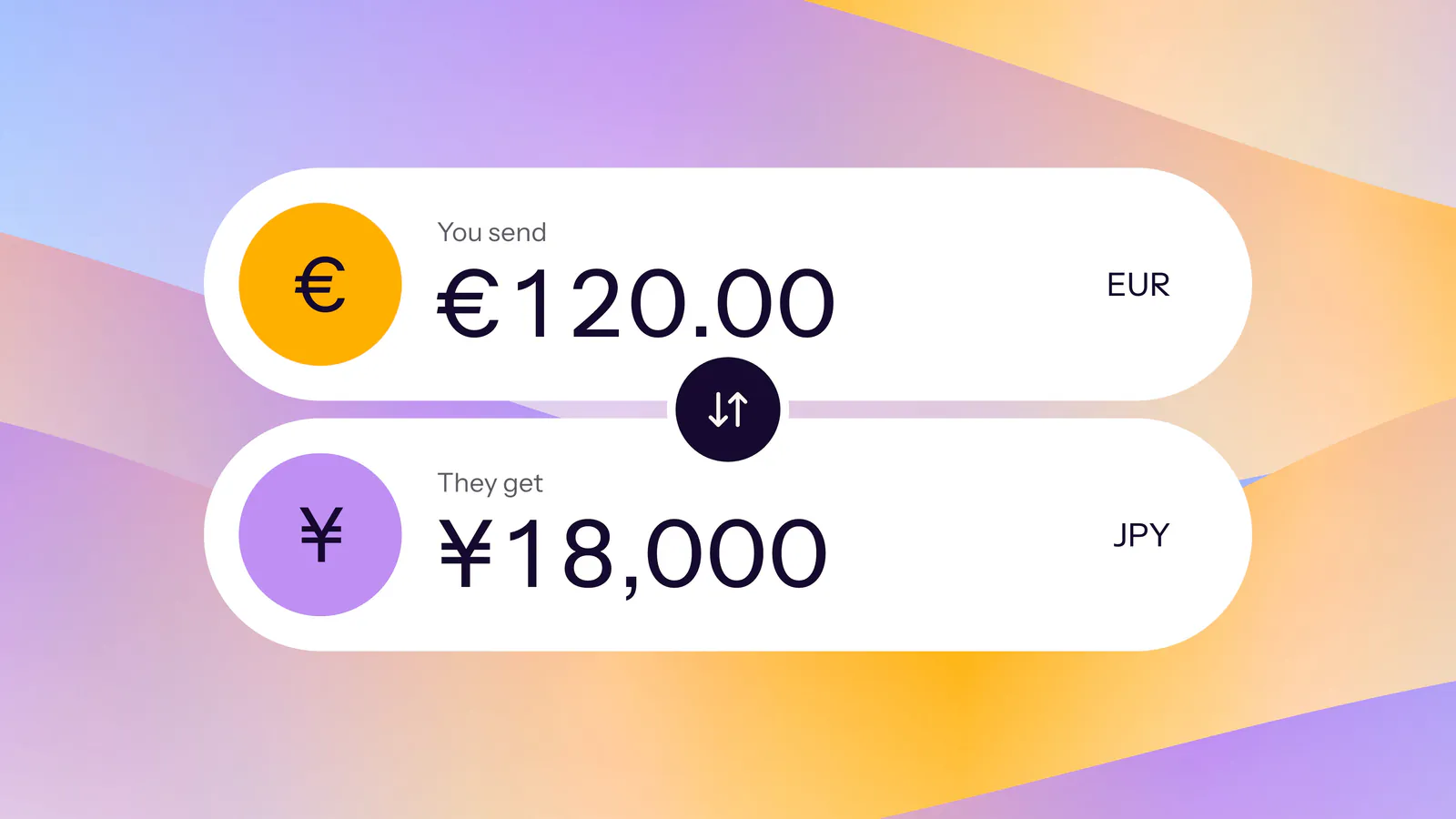
Currency converter: you send €120.00, they get ¥18,000
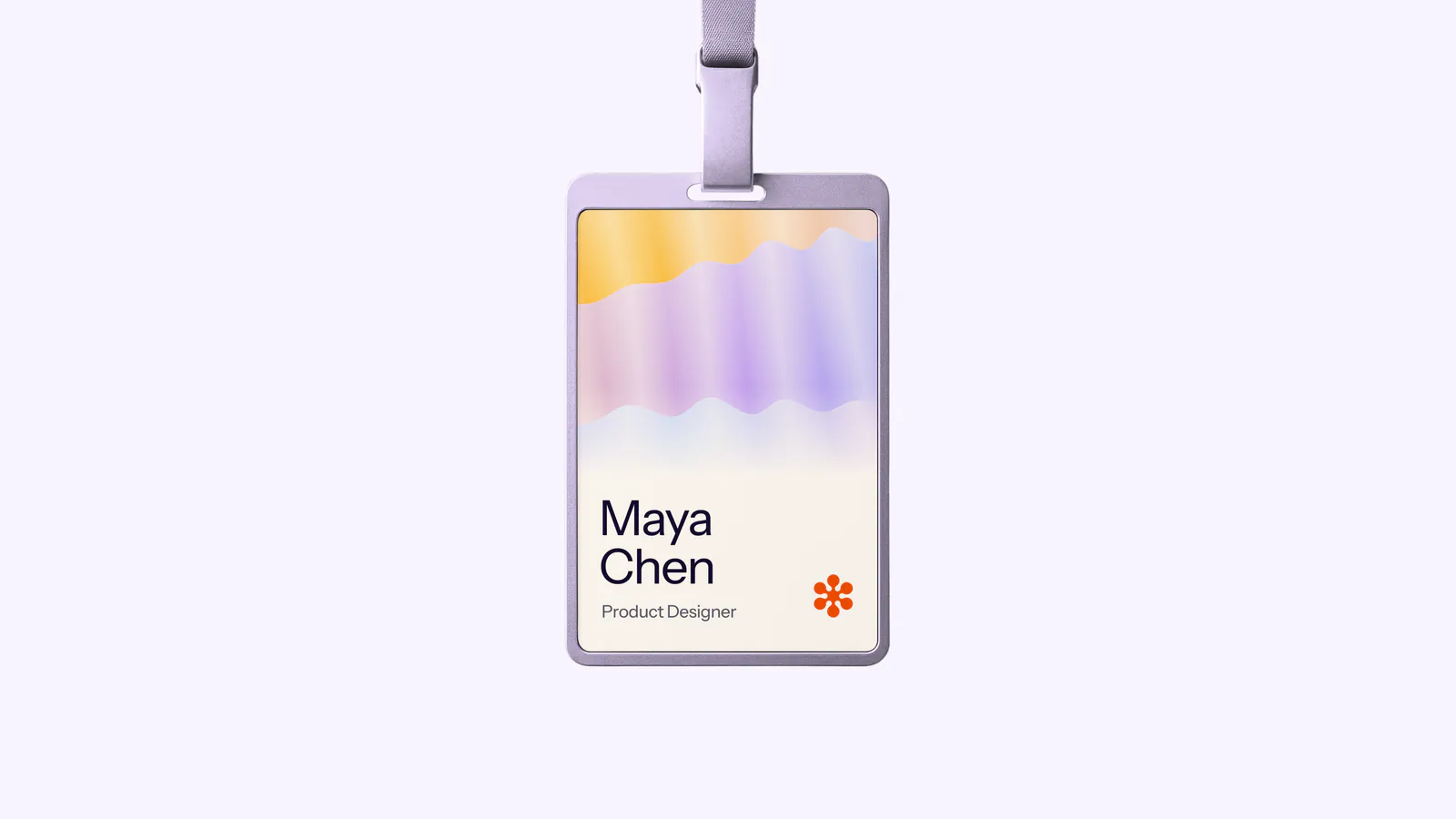
Coral Pay name badge for Maya Chen, Product Designer
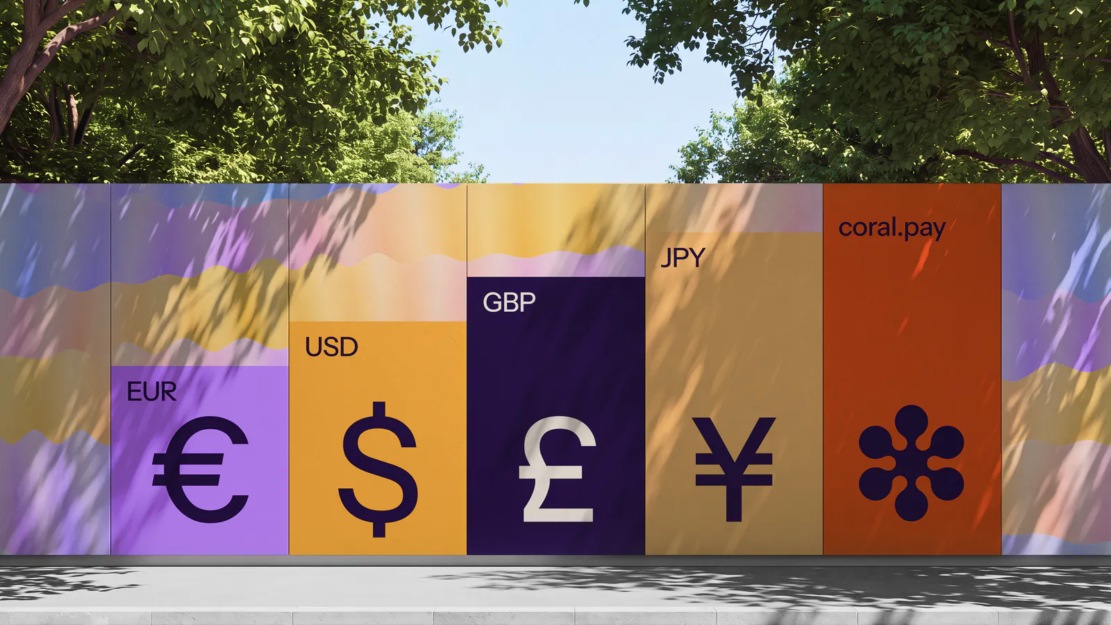
Construction hoarding with EUR, USD, GBP and JPY symbols and coral.pay
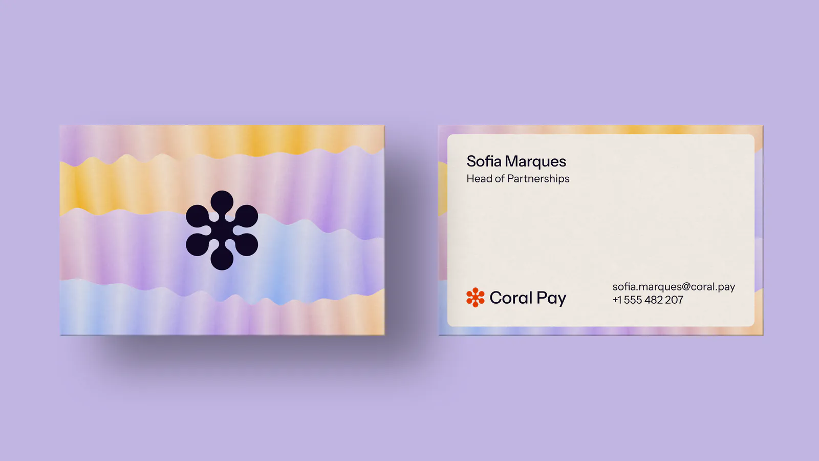
Coral Pay business cards: the mark on iridescent waves, and Sofia Marques's card
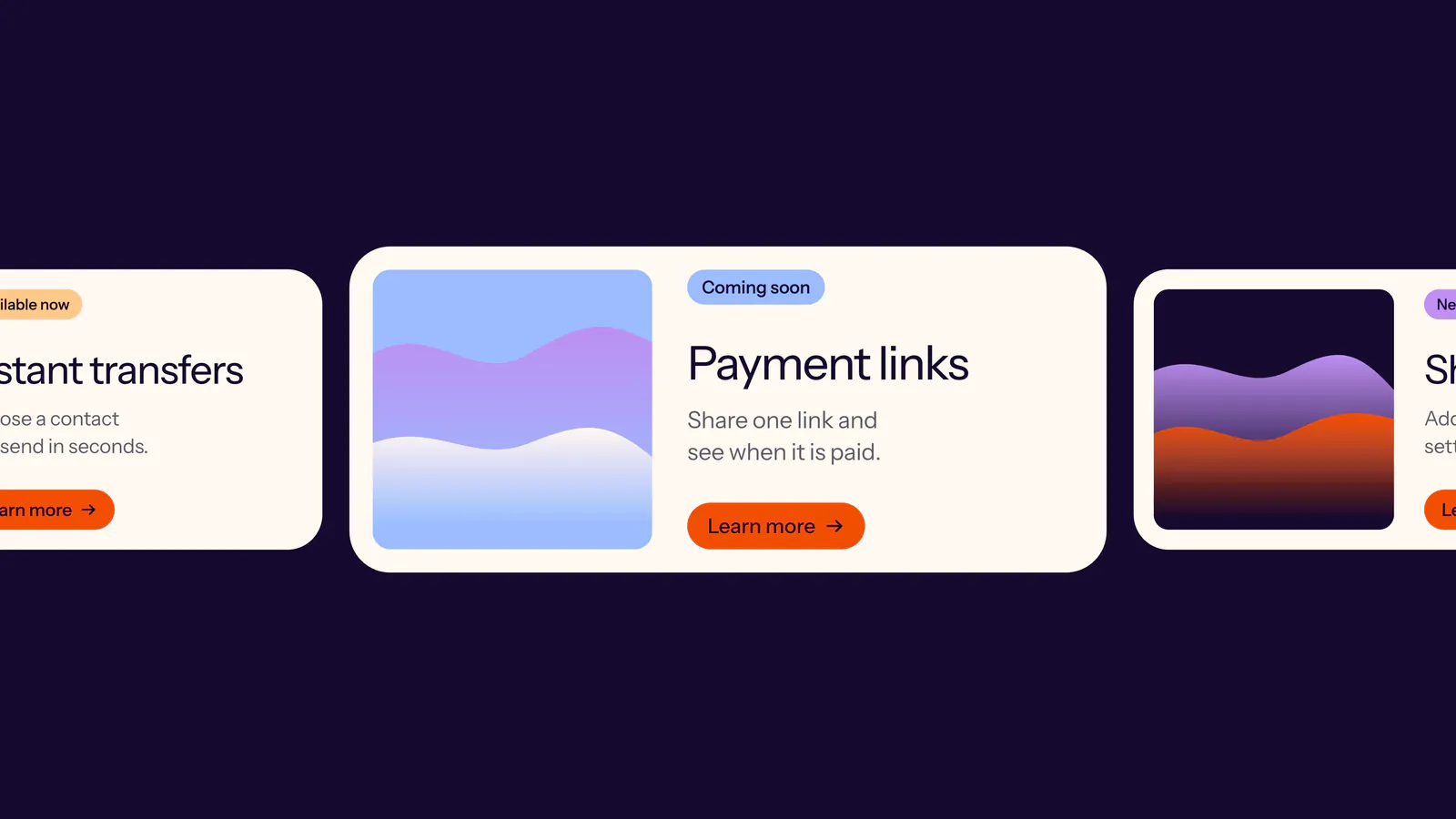
Feature cards sliding past: Instant transfers, Payment links, Shared bills
Orange Coral Pay folder with the mark and name embossed on the cover
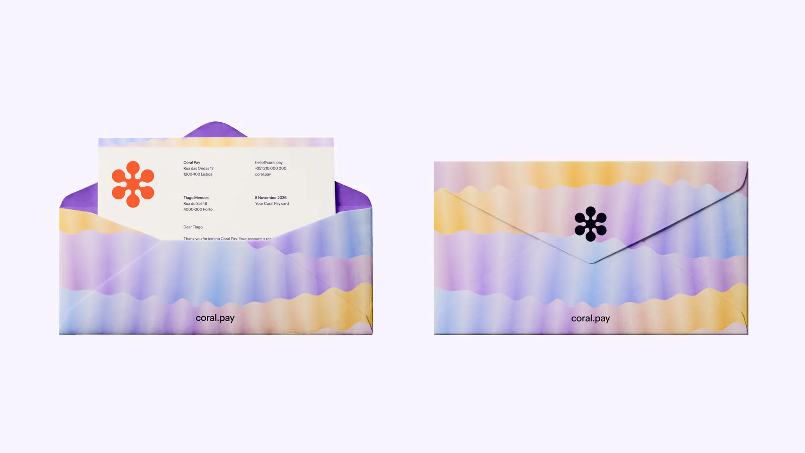
Coral Pay envelopes and a letter in iridescent waves
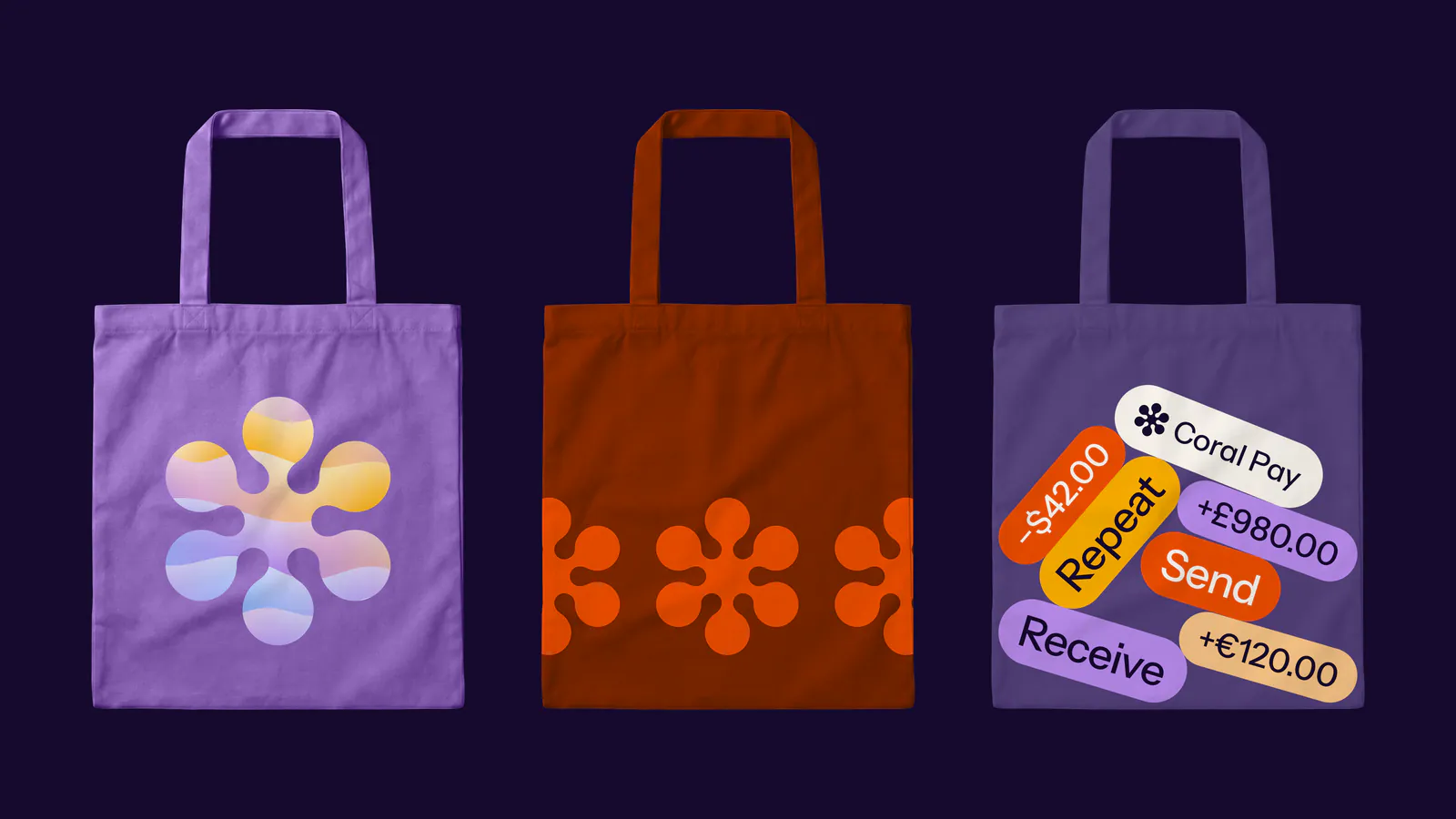
Three Coral Pay tote bags: a glass mark, orange petals, and amount stickers
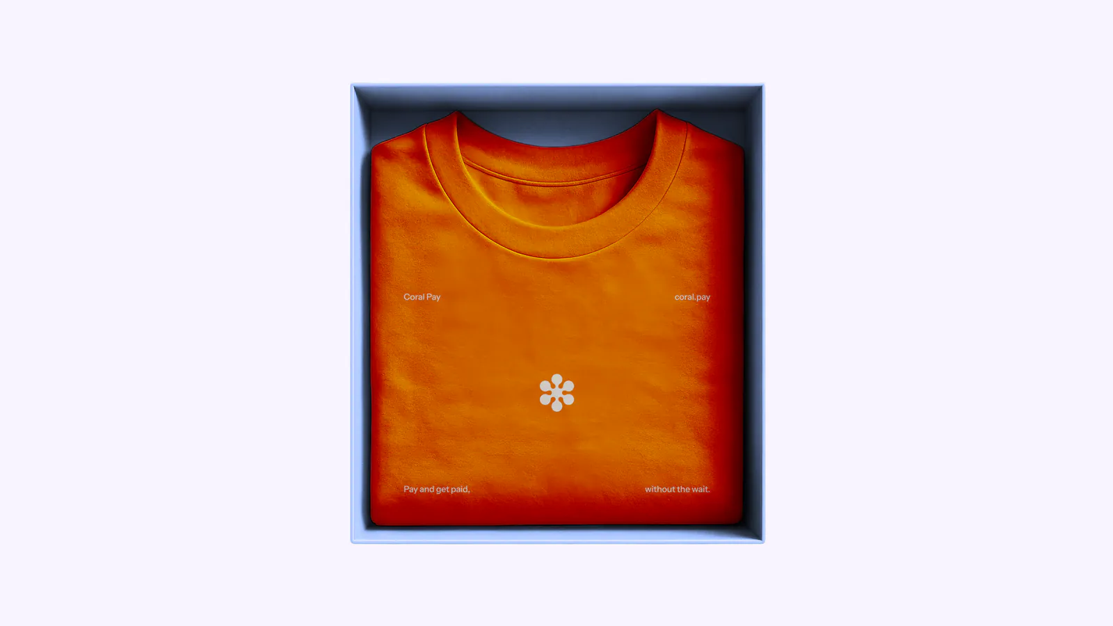
Orange Coral Pay T-shirt folded in a box
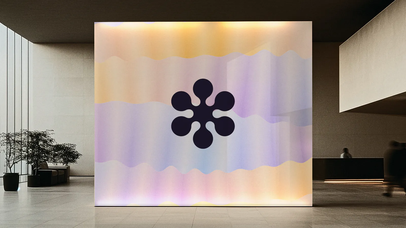
Lit lobby wall with the Coral Pay mark over iridescent waves