New Path: brand identity case study
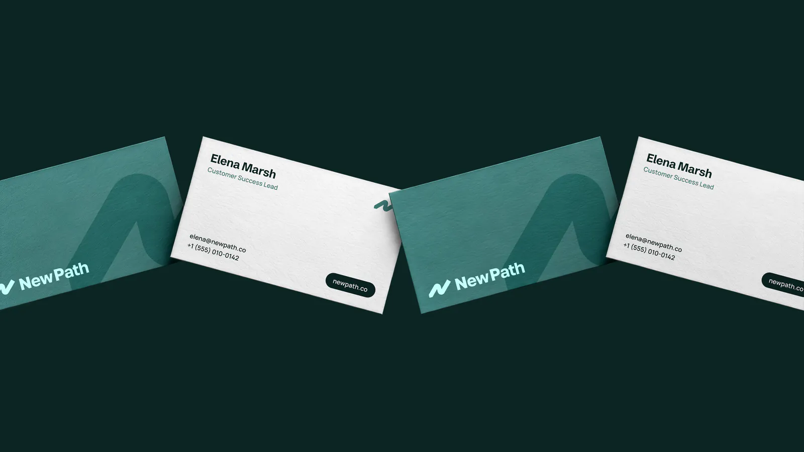
New Path business cards on dark green, with the wordmark and the N path mark
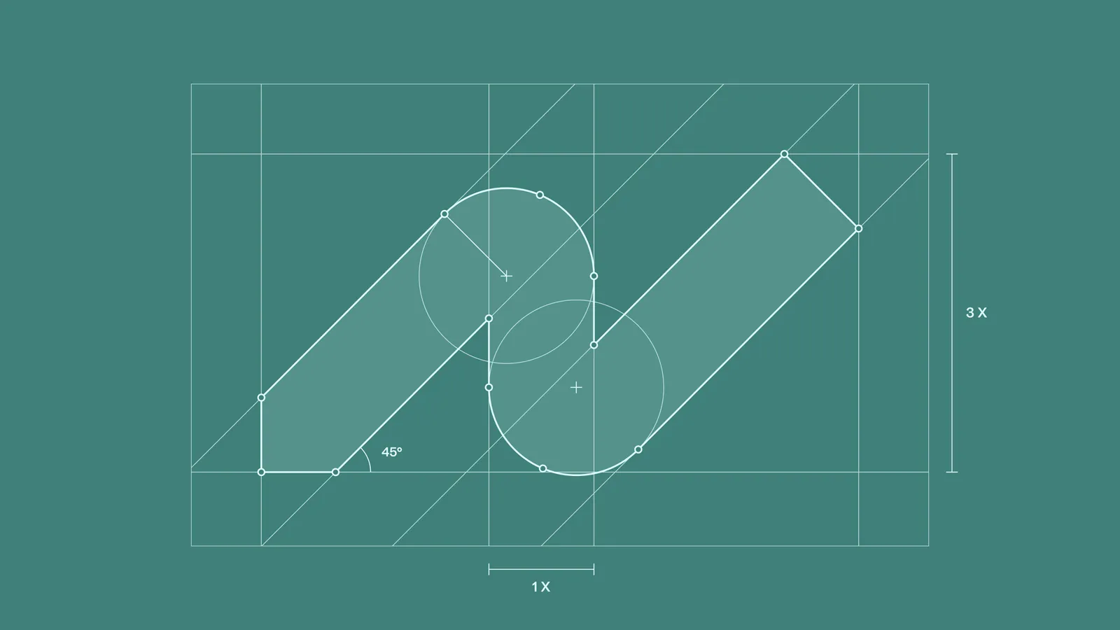
Construction grid for the New Path mark: a path with 45-degree turns
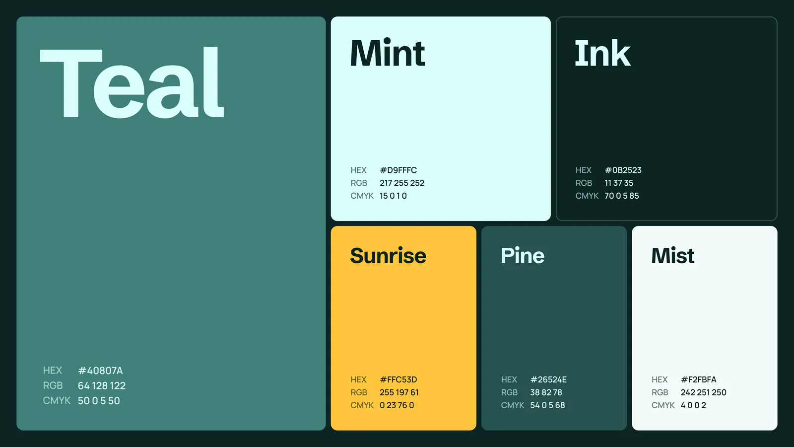
New Path colour palette: Teal, Mint, Ink, Sunrise, Pine and Mist, with HEX, RGB and CMYK values
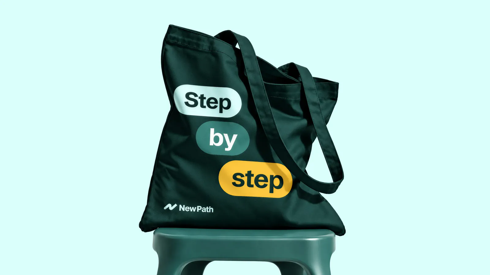
Tote bag reading Step by step in pill-shaped labels, on a stool against pale mint
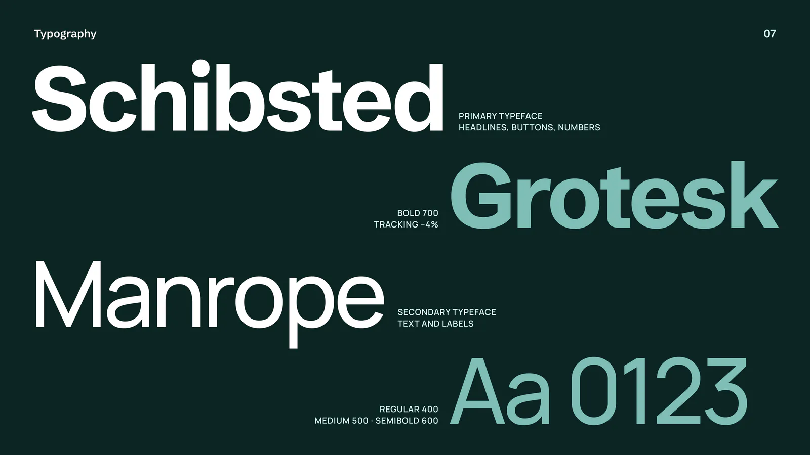
Typography: Schibsted Grotesk for headlines and Manrope for text and labels
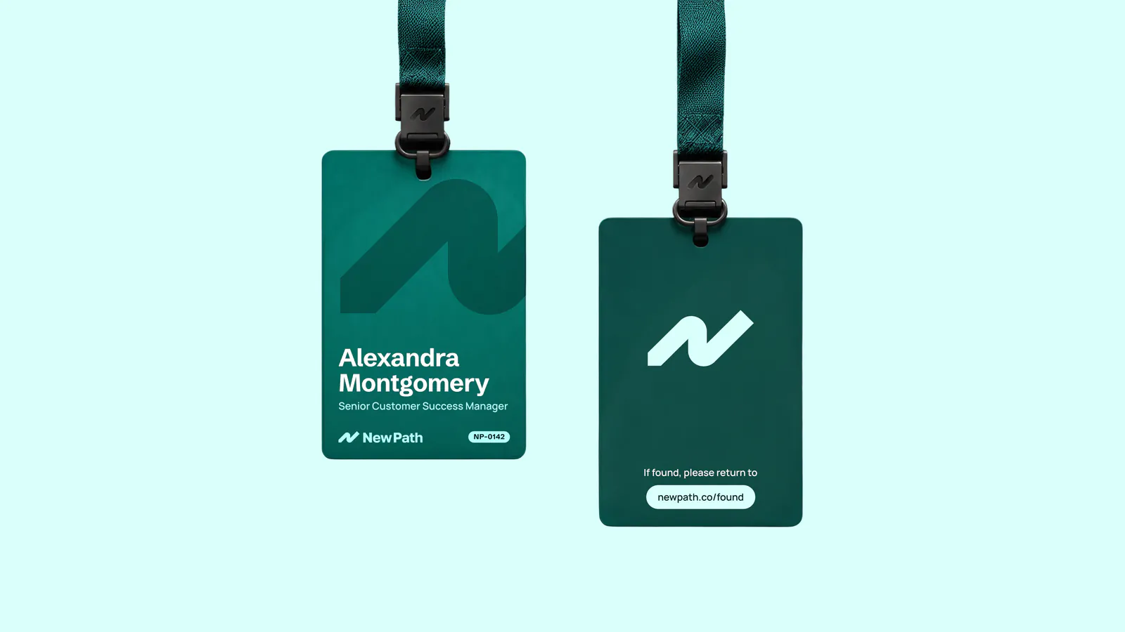
Staff lanyard badges in teal with the New Path mark, on mint
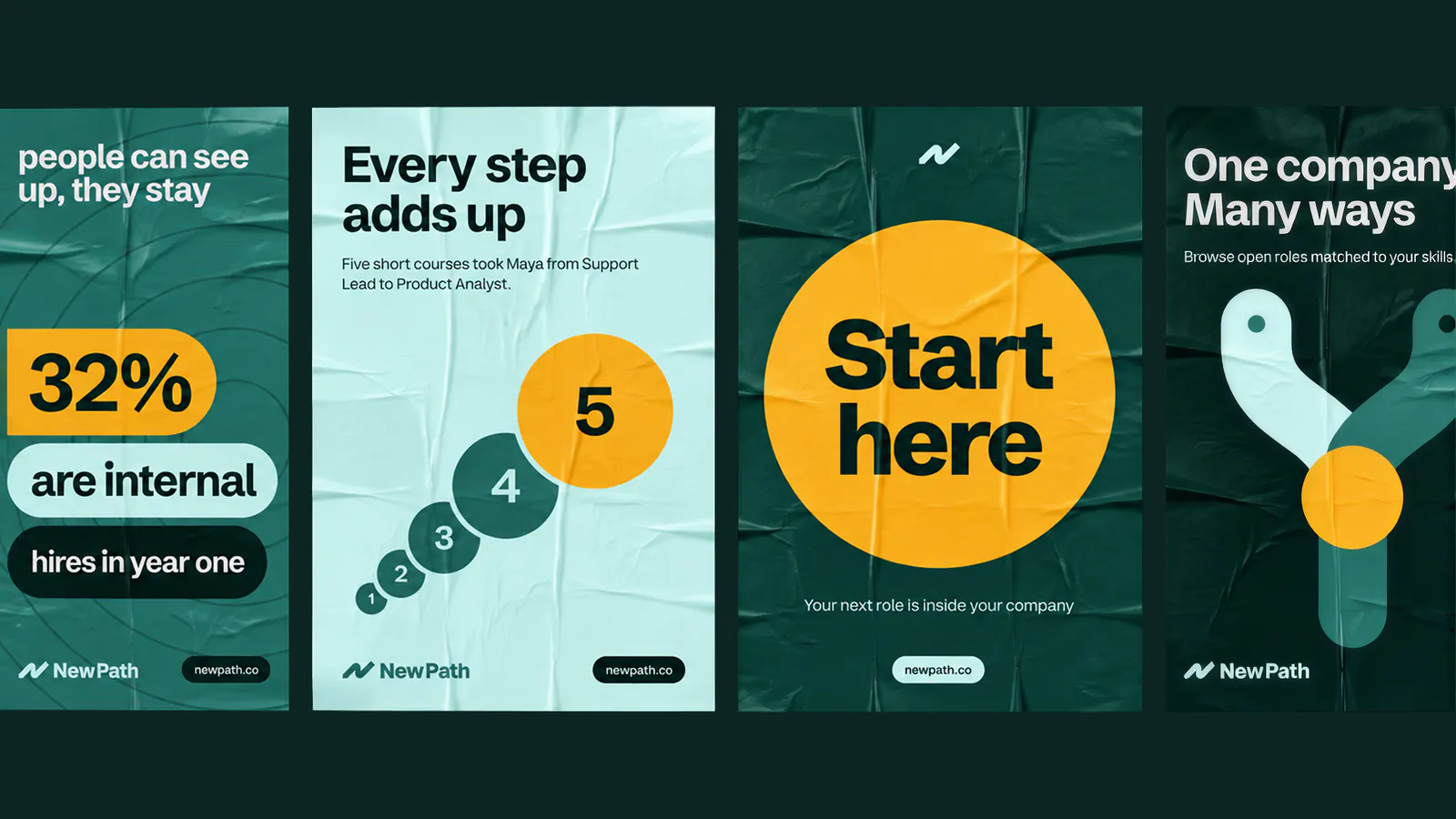
Four posters in teal and mint: People can see up, they stay; Every step adds up; Start here; One company, many ways
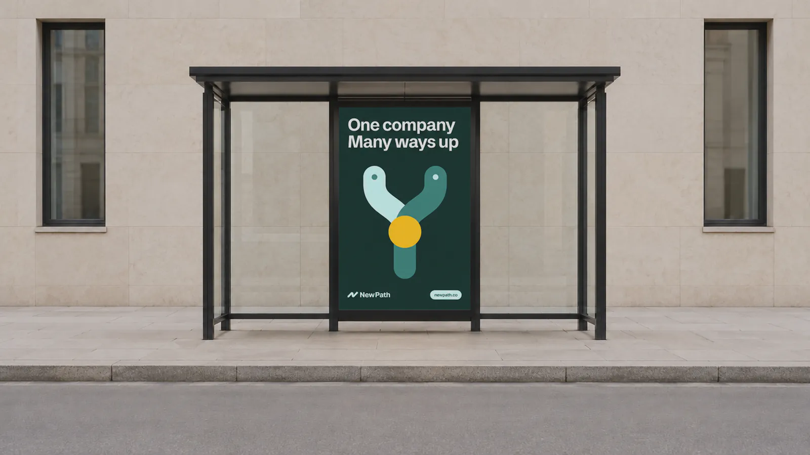
Bus shelter poster reading One company. Many ways up, with a Y-shaped path graphic
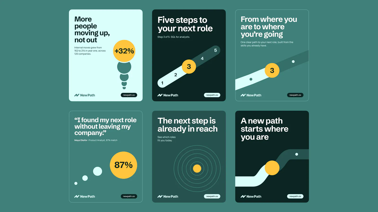
Six social tiles about career steps, internal moves and new paths
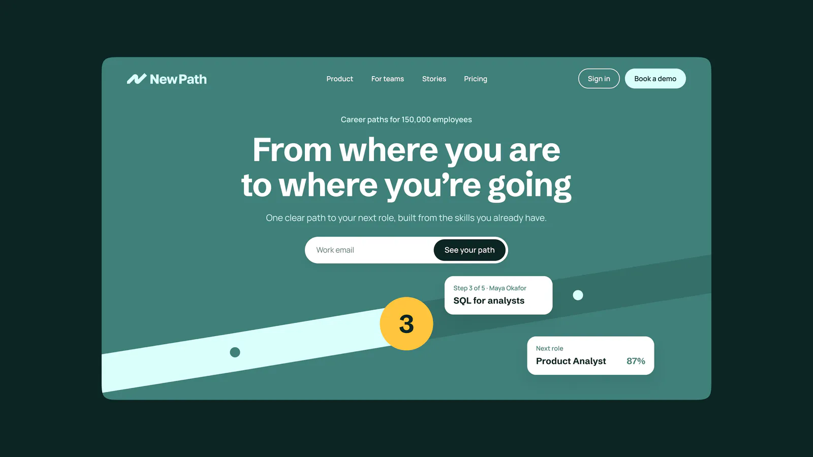
New Path website hero: From where you are to where you're going, with the path graphic and a work email field
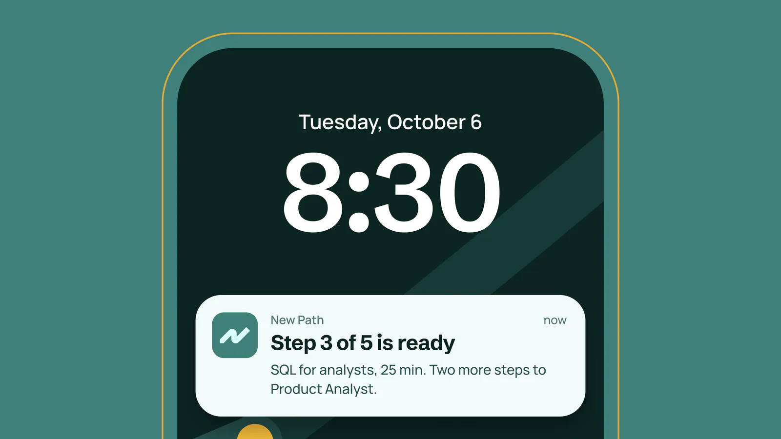
Phone lock screen with a New Path notification: Step 3 of 5 is ready
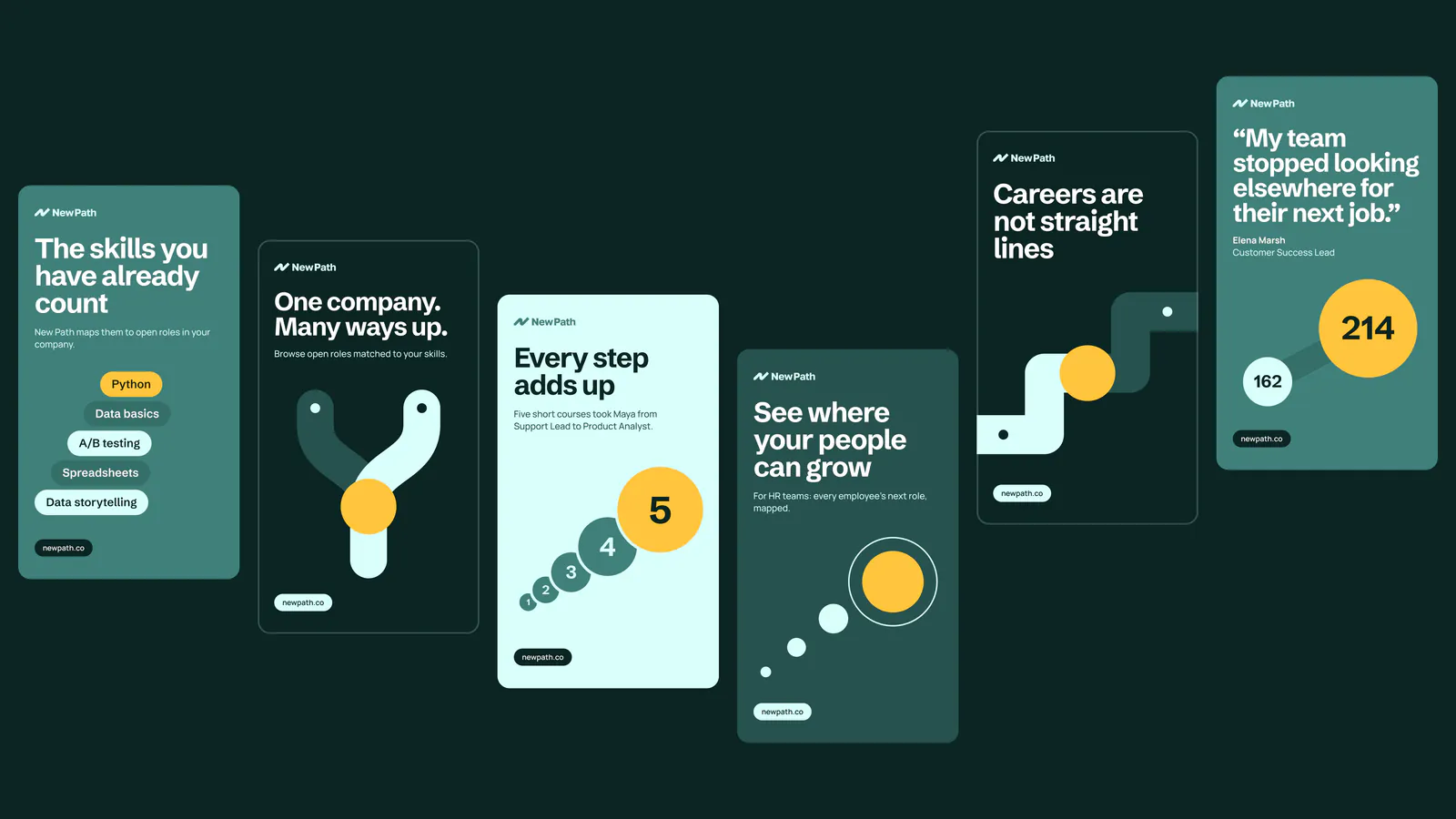
Set of portrait ads in teal and dark green showing the path, steps and statistics
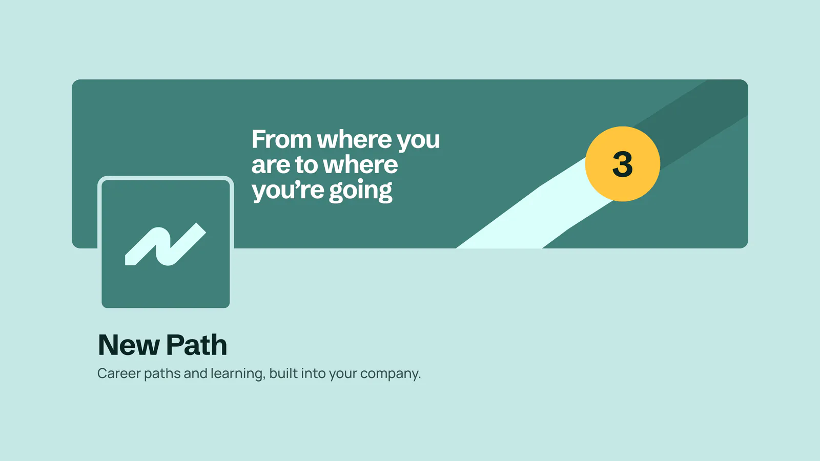
Social profile banner and avatar with the New Path mark: Career paths and learning, built into your company
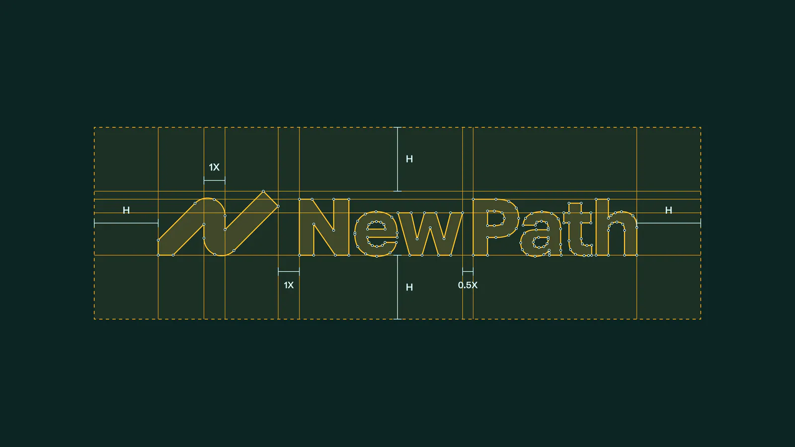
Clear space and proportion guide for the New Path wordmark, in amber lines on dark green
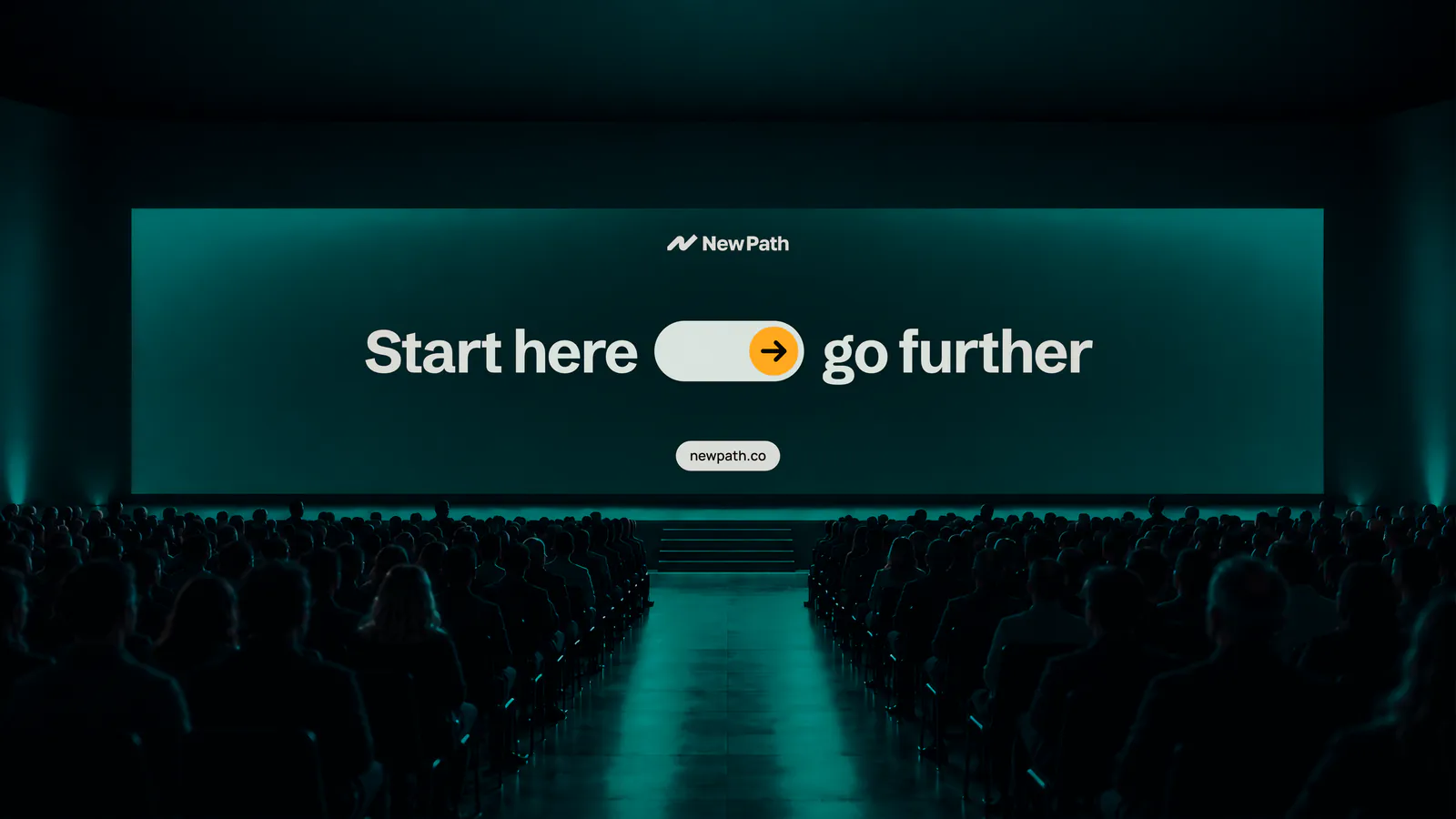
Stage screen reading Start here, go further, in front of an audience