Sauge: brand identity case study

Sauge wordmark in cream over a hand holding a dropper of serum, on dark brown
Sauge wordmark in black on a soft amber gradient wash
Close-up of the Sauge wordmark letterforms with vector anchor points, on espresso brown
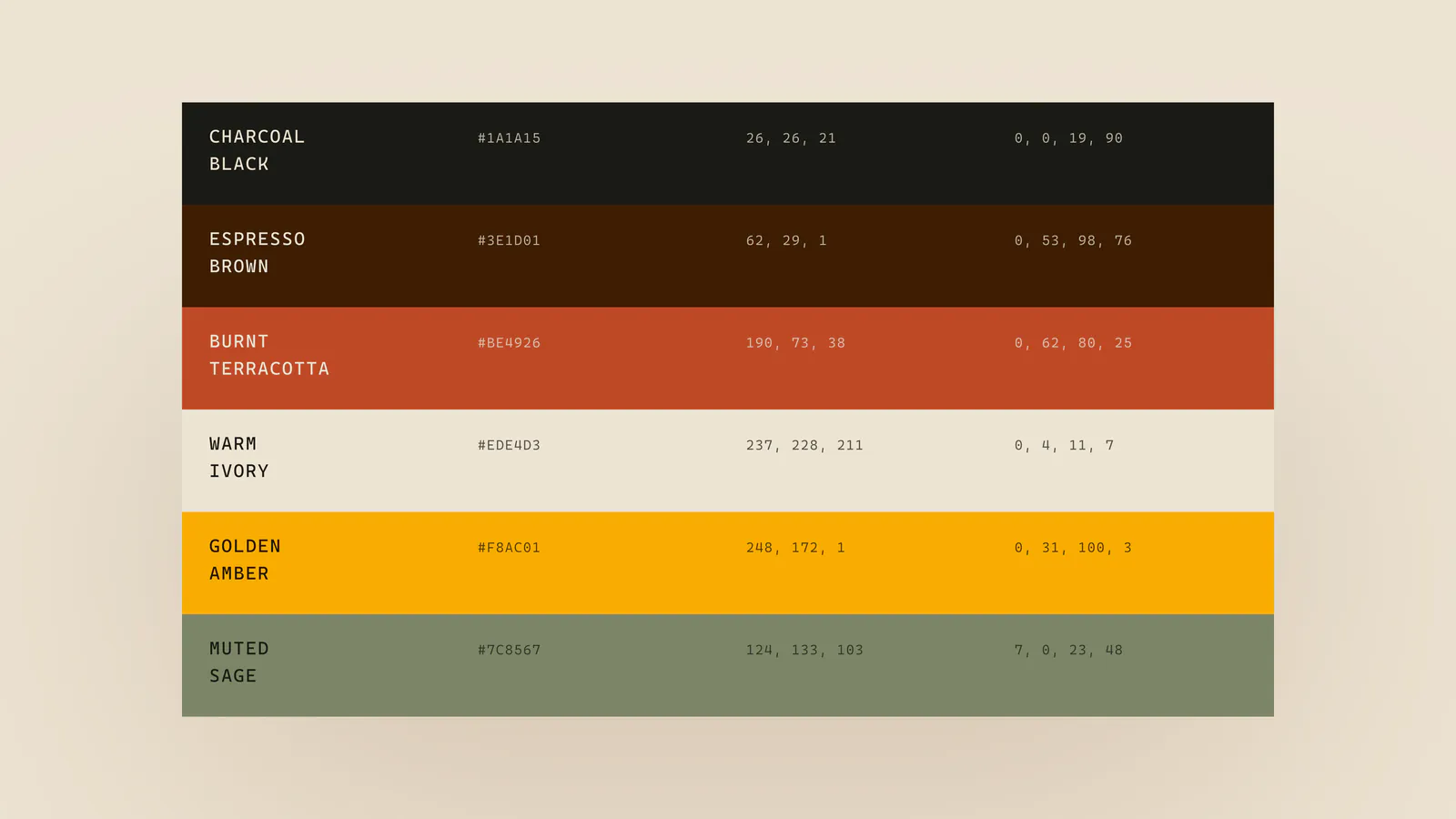
Sauge colour palette: charcoal black, espresso brown, burnt terracotta, warm ivory, golden amber and muted sage
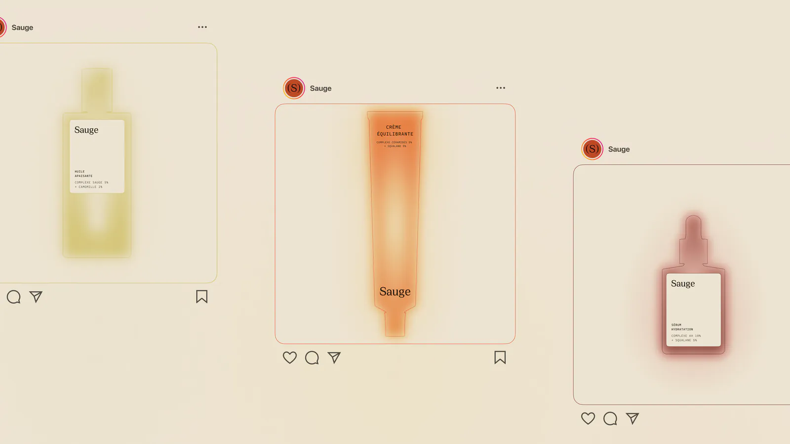
Sauge Instagram posts showing a glowing bottle, tube and dropper on ivory
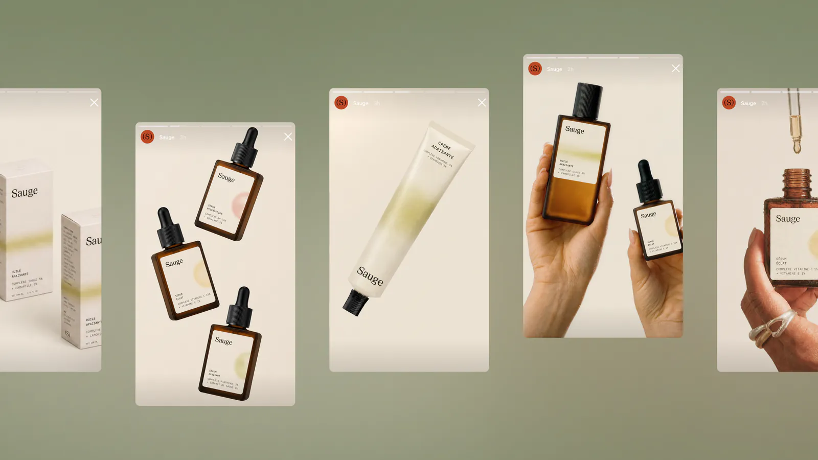
Sauge Instagram stories on sage green with serum bottles, a tube and hands holding the products
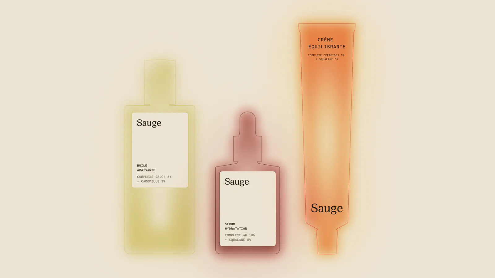
A bottle, a dropper and a tube, each with a soft coloured glow, on ivory
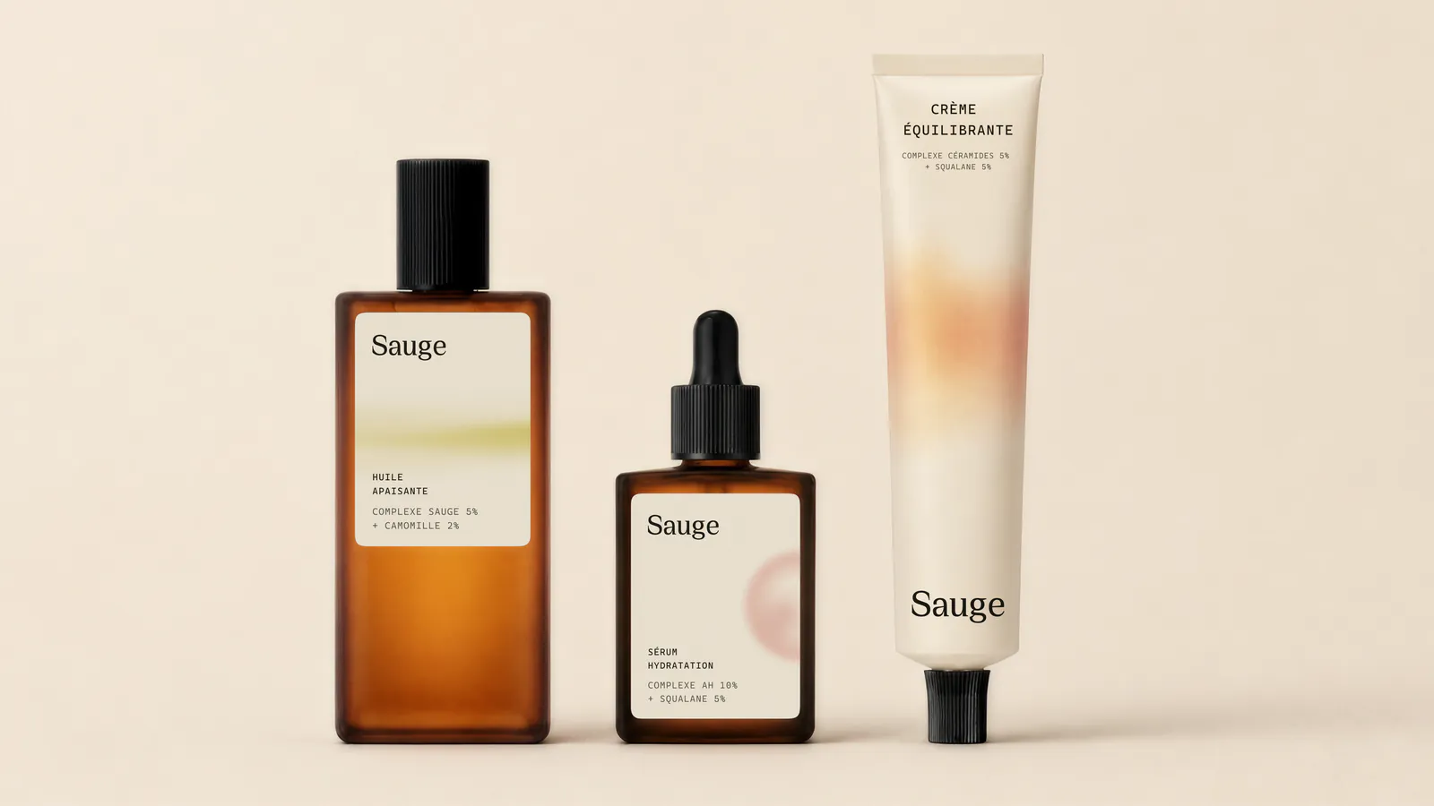
Amber glass bottle, dropper bottle and cream tube with Sauge labels on warm ivory
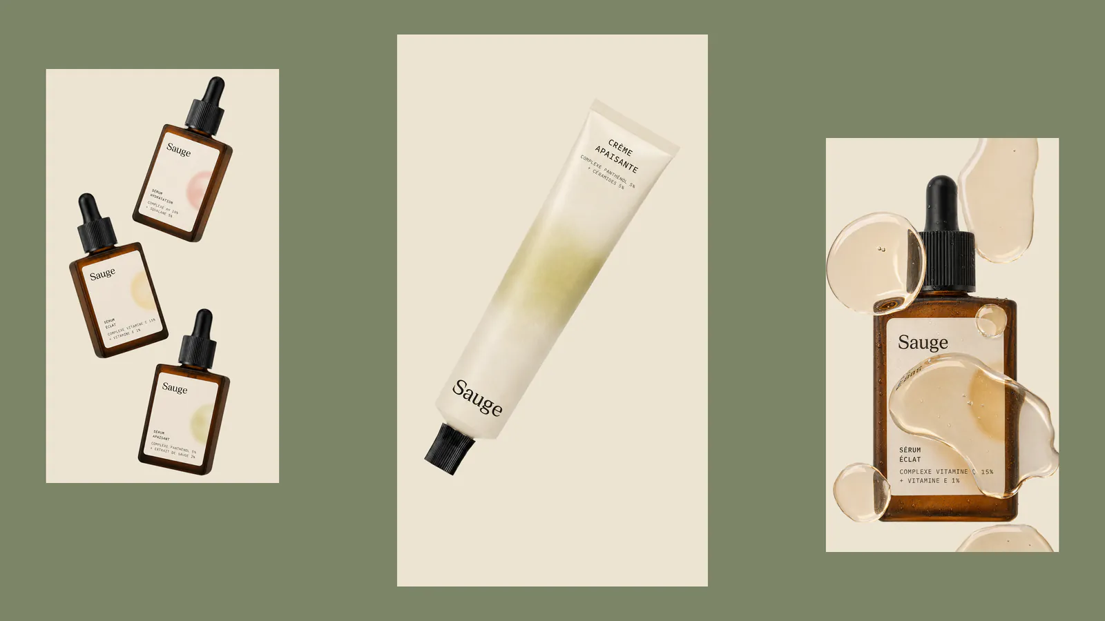
Sauge social tiles on sage green: serum bottles, a tube and a dropper over serum swatches
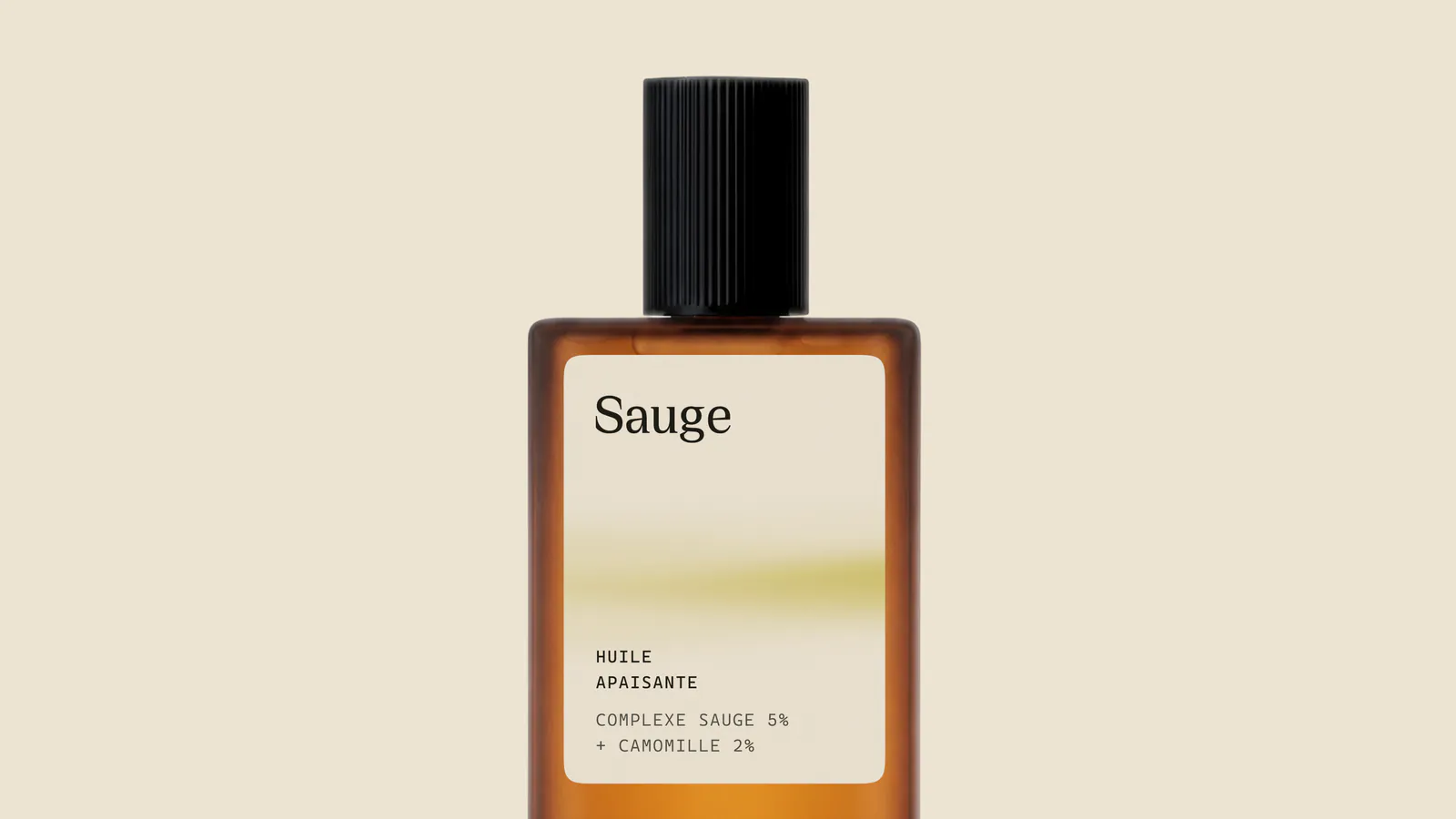
Close view of the amber Sauge bottle with the Huile Apaisante label
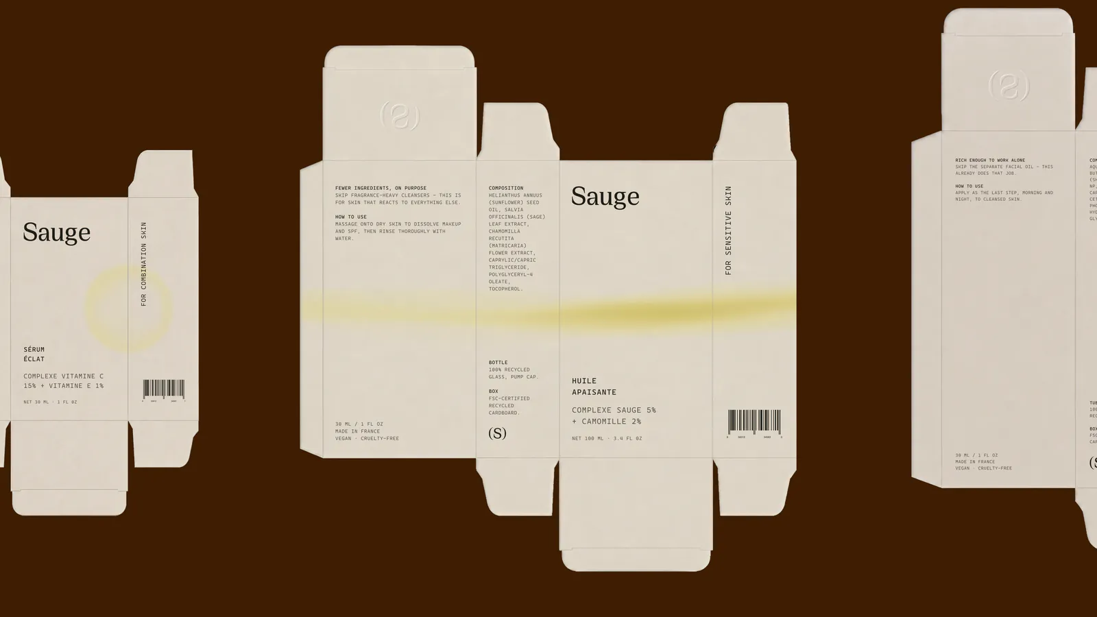
Unfolded Sauge carton designs on espresso brown
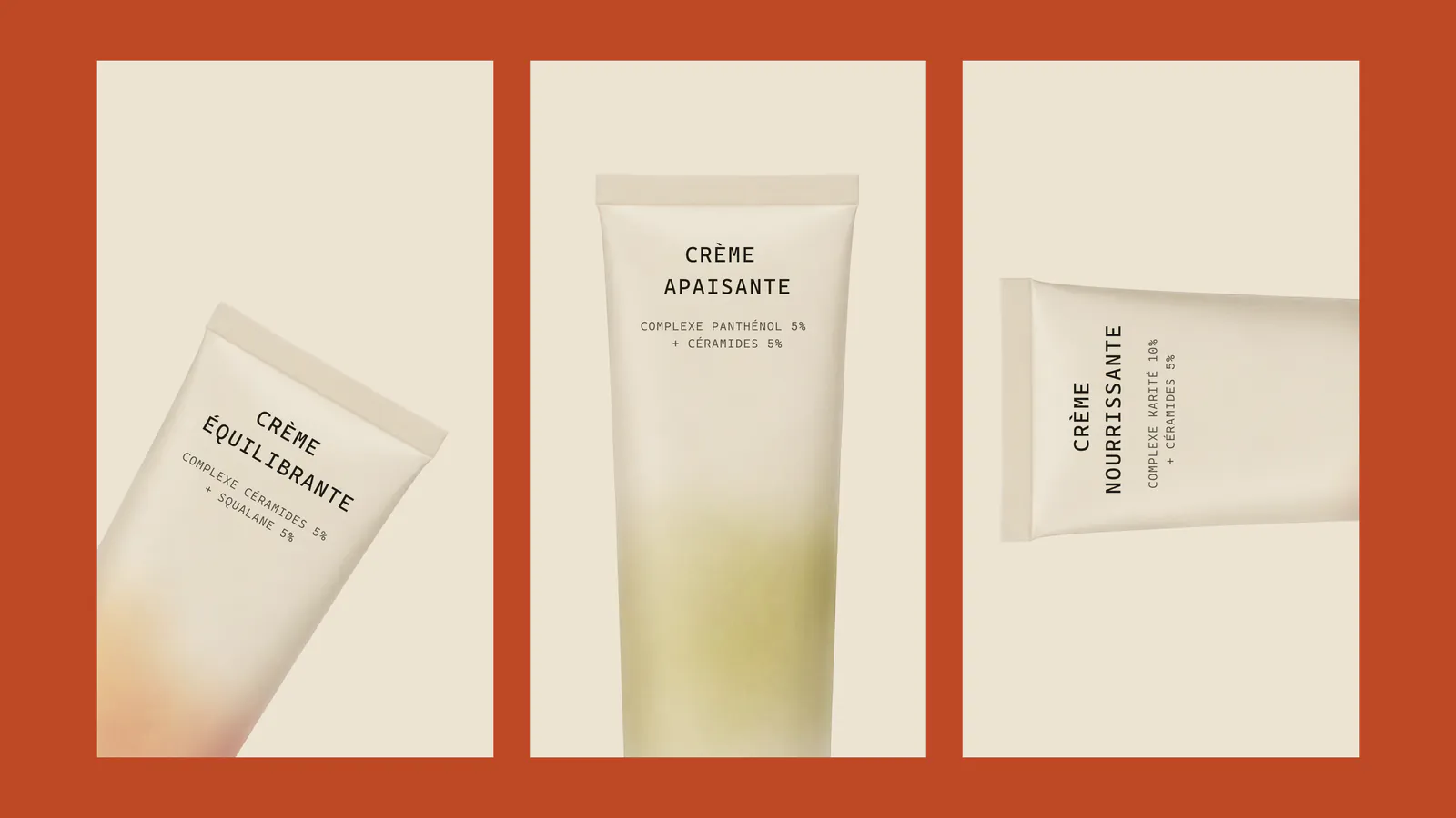
Sauge tubes on terracotta panels: Crème Équilibrante, Crème Apaisante and Crème Nourrissante
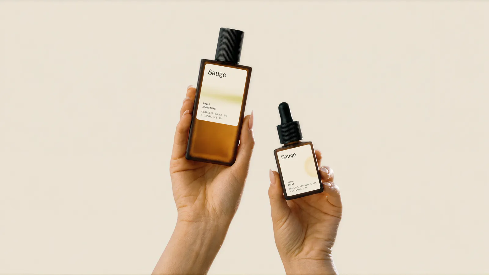
Hands holding two Sauge amber bottles against ivory
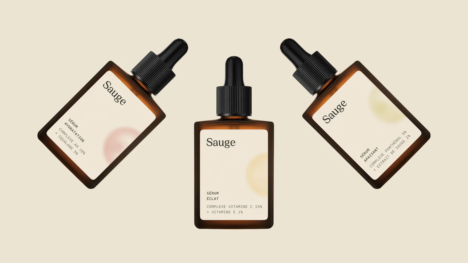
Three Sauge amber dropper bottles at angles on ivory
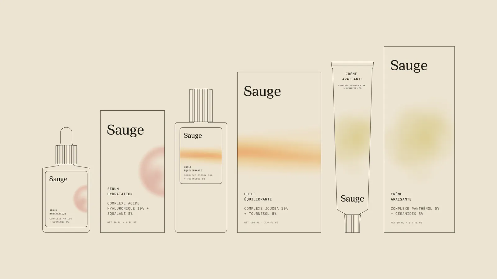
Line drawings of the Sauge range: bottles, cartons and tubes
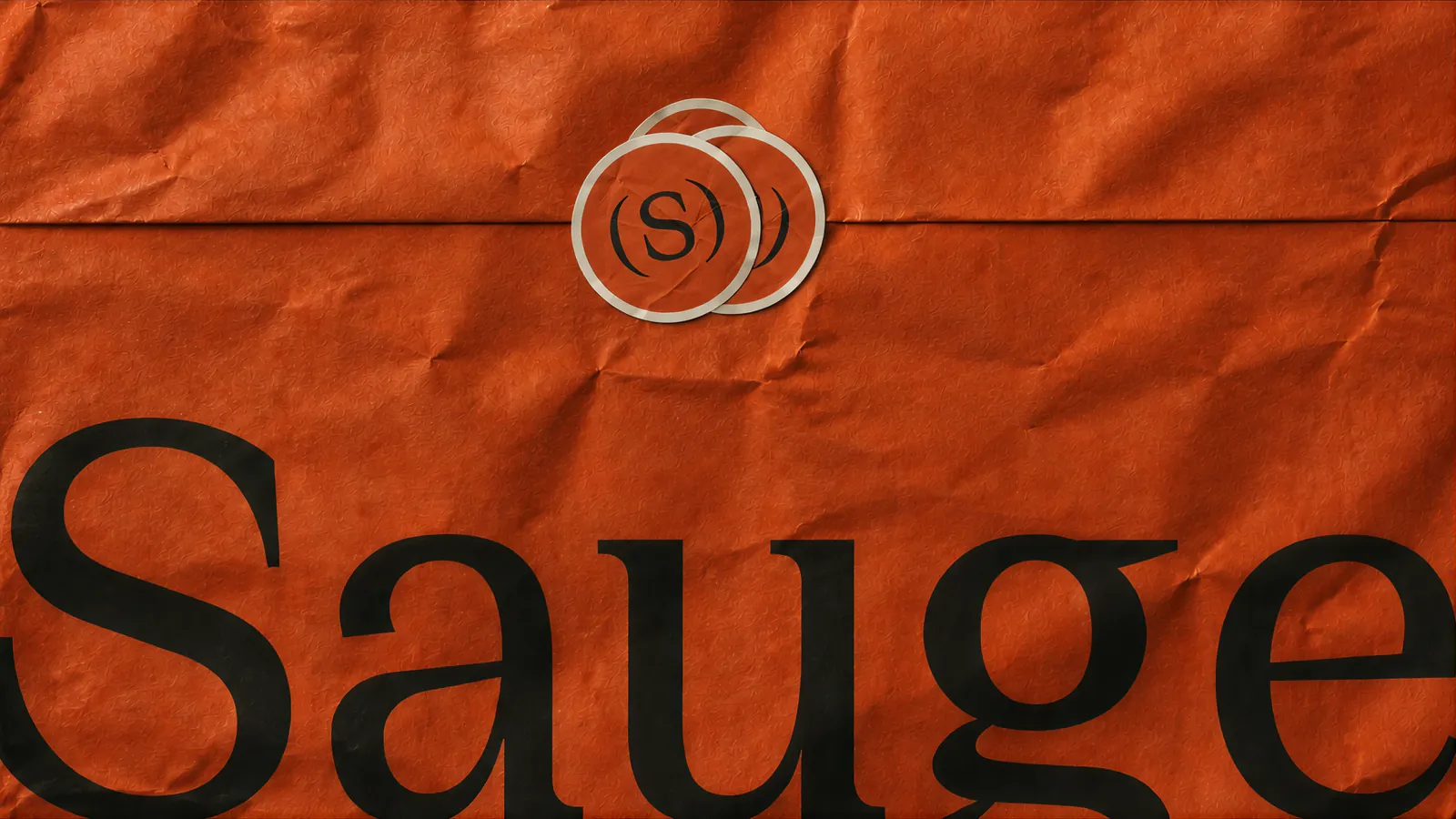
Sauge wordmark and (S) mark on crumpled terracotta paper